
The Alaska Airlines logo has gone through several transformations since the airline’s inception in 1932. Each version of the logo reflects not only the airline’s growth but also its connection to the stunning landscapes and rich culture of Alaska. As the logo evolved, it became a symbol of adventure and connectivity, representing the airline’s commitment to serving the diverse needs of its passengers. This article explores the journey of the Alaska Airlines logo, highlighting its design changes, cultural significance, and the role it plays in the airline’s branding and marketing strategies.
Key Takeaways
- The Alaska Airlines logo reflects the airline’s deep ties to Alaskan culture and landscape.
- Each logo iteration symbolizes the airline’s growth and evolving brand identity over the years.
- Modern design elements incorporate customer feedback and contemporary color schemes.
- The logo plays a crucial role in marketing, enhancing brand recognition and customer loyalty.
- It has become a recognizable symbol in popular culture, influencing both aviation and local communities.
The Origins of The Alaska Airlines Logo

Historical Context of Airline Branding
Back in the day, airline branding wasn’t the slick, sophisticated operation it is now. It was more about function than fashion. Airlines were just trying to get people from point A to point B safely, and the logos? Well, they were often an afterthought. Think simple, straightforward designs – nothing too fancy. It’s interesting to see how much things have changed. Now, a logo can make or break an airline’s image. It’s a cutthroat business, and brand recognition is key.
Initial Design Elements
When Alaska Airlines first took to the skies, the initial design elements of its logo were heavily influenced by the practical needs of the time and the spirit of the Alaskan frontier. The early logos often featured imagery that evoked a sense of adventure and the ruggedness of the Alaskan landscape. Colors were generally simple and bold, chosen for visibility and ease of recognition. These early designs aimed to convey reliability and trustworthiness, essential qualities for an airline operating in challenging conditions. It wasn’t about being flashy; it was about being dependable. The airline needed to show it could handle the tough Alaskan environment. It’s a far cry from the sleek designs we see today, but it served its purpose well. The focus was on functionality over aesthetics.
Influence of Alaskan Culture
The Alaskan culture has always been a huge part of Alaska Airlines’ identity, and that definitely shows in the logo’s evolution. The logo isn’t just a random design; it’s a reflection of the state’s spirit. Think about it: Alaska is all about adventure, vast landscapes, and a strong connection to nature. The airline’s branding needed to capture that. The use of colors, imagery, and overall design aimed to resonate with Alaskans and evoke a sense of pride and belonging. It’s more than just a logo; it’s a symbol of the state itself. The airline’s commitment to the region is clear, and it’s something they’ve worked hard to maintain over the years.
The airline’s logo has always been more than just a pretty picture. It’s a symbol of Alaska itself, representing the state’s unique culture and spirit. It’s a reminder of the airline’s deep roots in the region and its commitment to serving the people of Alaska.
The First Iteration of The Alaska Airlines Logo
Design Features and Symbolism
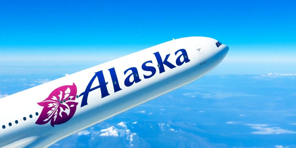
The initial logo of Alaska Airlines was a significant departure from earlier, less defined branding efforts. It featured a stylized image of an Eskimo face, enclosed within a circle. This design choice was intended to represent the airline’s strong connection to the Alaskan people and its geographical roots. The colors were simple, often using a combination of blue and white to evoke the Alaskan sky and snow. The overall effect was a logo that was both distinctive and memorable, quickly becoming synonymous with the airline itself.
Public Reception and Impact
The Eskimo logo was generally well-received by the public, particularly within Alaska. It resonated with local communities and helped to solidify the airline’s image as a truly Alaskan carrier. However, it also faced some criticism, especially in later years, for potentially perpetuating stereotypes. Despite this, the logo played a crucial role in building brand recognition and fostering customer loyalty during the airline’s formative years. It was a symbol that many Alaskans identified with, representing a sense of pride and connection to their home state. The airline launched its website in 1995 online airline services.
Evolution of Brand Identity
The introduction of the Eskimo logo marked a turning point in Alaska Airlines’ brand identity. It moved the airline away from a more generic image and towards a distinct, culturally relevant representation. This logo became the cornerstone of the airline’s marketing efforts, appearing on everything from aircraft livery to advertising materials. Over time, the logo underwent minor modifications, but the core design remained consistent for several decades, demonstrating its enduring appeal and effectiveness in establishing a strong brand presence. The airline has partnered with Alaska Business Alaska Business. Heli Alaska offers tours Alaska State Fair Tour. The name and logo hold value Kingdom’s aviation legacy.
The logo’s success can be attributed to its simplicity and its ability to communicate a clear message about the airline’s identity and values. It was a symbol that resonated with both Alaskans and travelers, helping to establish Alaska Airlines as a unique and trusted brand in the competitive airline industry.
The Transition to A Modern Logo
Rationale Behind the Redesign
Over time, even the most iconic logos can start to feel a little dated. For Alaska Airlines, the move toward a more modern logo wasn’t just about aesthetics; it was about reflecting the airline’s growth, its evolving values, and its commitment to staying relevant in a competitive market. The old logo had served them well, but the company recognized the need for a refresh to better communicate their contemporary vision. It’s like when you remodel your house – sometimes you just need to update things to better suit your current lifestyle. This is similar to how airline liveries evolve.
Incorporation of New Colors
Color plays a huge role in how we perceive a brand. The transition to a modern logo often involves a careful consideration of the color palette. Alaska Airlines likely explored different color combinations to evoke specific emotions and associations. Maybe they wanted to emphasize their connection to the Alaskan landscape with new shades of blue and green, or perhaps they aimed for a brighter, more energetic feel to appeal to a younger demographic. Whatever the reason, the choice of colors was a strategic decision designed to enhance the logo’s impact and memorability. The new colors might also reflect a commitment to sustainability, aligning with current trends in the aviation industry.
Feedback from Customers and Stakeholders
Any major brand change is going to get some opinions, right? Before rolling out the new logo, Alaska Airlines probably gathered feedback from a variety of sources. This could include:
- Customer surveys
- Focus groups
- Employee input
- Stakeholder consultations
Getting buy-in from these groups is important because a logo isn’t just an image; it’s a symbol that represents the entire company. If customers don’t like the new design, it can negatively impact brand loyalty. Similarly, if employees don’t feel connected to the logo, it can affect morale. So, gathering and acting on feedback is a critical step in the redesign process. The goal is to ensure that the new logo resonates with everyone who has a stake in the airline’s success. The Alaska Airlines lounges are also designed with customer experience in mind.
The Significance of The Alaska Airlines Logo

The Alaska Airlines logo is more than just a pretty picture on a plane; it’s a symbol loaded with meaning for both the company and the people it serves. It represents a whole host of things, from the spirit of adventure to the connections it helps create.
Symbol of Adventure and Exploration
The Eskimo on the tail isn’t just a face; it’s a nod to the adventurous spirit that defines Alaska. It evokes images of vast landscapes, untamed wilderness, and the thrill of exploring the unknown. The logo reminds people of the unique experiences that await them when they fly with Alaska Airlines. It’s a visual cue that speaks to the heart of what makes Alaska special. The airline’s commitment to adventure is further exemplified by their adventure tours across the state.
Representation of Connectivity
Beyond adventure, the logo also represents connectivity. Alaska Airlines plays a vital role in linking remote communities within Alaska and connecting the state to the rest of the world. The logo serves as a constant reminder of the airline’s mission to bridge distances and bring people together. It’s about more than just flying; it’s about building relationships and fostering a sense of community. The airline’s extensive domestic and international services further enhance this connectivity.
Cultural Significance in Alaska
In Alaska, the Alaska Airlines logo holds a special place in the hearts of many. It’s become an iconic symbol of the state, representing its unique culture and heritage. The Eskimo image is a respectful tribute to the indigenous people of Alaska, acknowledging their history and contributions. It’s a symbol that resonates deeply with Alaskans, fostering a sense of pride and belonging. The airline’s deep connection to the region is evident in its commitment to Alaskan culture.
The Logo’s Role in Marketing Strategies
The Alaska Airlines logo isn’t just a pretty picture; it’s a workhorse in their marketing efforts. It’s the visual shorthand for everything the airline wants you to think about when you book a flight. Let’s look at how they use it.
Brand Recognition and Loyalty
The Alaska Airlines logo is instantly recognizable, fostering brand loyalty. Think about it: that smiling face on the tail is hard to forget. It helps people quickly identify Alaska Airlines, whether they’re at an airport or seeing an ad online. This recognition builds trust and encourages repeat business. The airline has done a good job making sure the logo is consistent across all platforms, which helps cement it in people’s minds. It’s a simple, effective way to keep the brand top-of-mind.
Visual Storytelling in Advertising
The logo plays a big role in how Alaska Airlines tells its story through advertising. It’s not just slapped on ads; it’s integrated in a way that reinforces the airline’s values and brand identity. For example, ads often show the Eskimo smiling down on beautiful Alaskan landscapes, connecting the airline with adventure and the spirit of the region. This visual storytelling helps create an emotional connection with potential customers, making them more likely to choose Alaska Airlines for their next trip. The new Vice President of Brand Marketing will be responsible for developing the marketing strategy to align with the airline’s long-term vision of connecting guests globally.
Impact on Customer Engagement
The Alaska Airlines logo is a key tool for boosting customer engagement. It’s used on everything from social media posts to email campaigns, creating a consistent brand experience. The airline also uses the logo in interactive ways, like contests and promotions, to get people involved and excited about the brand. This kind of engagement helps build a community around Alaska Airlines, turning customers into loyal fans. Alaska Airlines’ marketing mix effectively combines the 4 Ps—product, price, place, and promotion—to deliver an exceptional travel experience.
The logo is more than just a design; it’s a symbol that customers connect with. It represents the airline’s history, values, and commitment to providing a great travel experience. By using the logo effectively in marketing, Alaska Airlines reinforces these associations and strengthens its relationship with customers.
The Alaska Airlines Logo in Popular Culture
Appearances in Media and Film
The Alaska Airlines logo has popped up in various movies and TV shows, often in scenes set in airports or featuring air travel. It’s not always a major plot point, but its presence adds a touch of realism and helps establish the setting. Think of it as a subtle nod to the airline’s presence in the real world. It’s kind of cool to spot it, like an inside joke for frequent flyers. You might see it on the tail of a plane in the background or on signage within an airport terminal. It’s a small detail, but it contributes to the overall authenticity of the scene. You can even find transparent PNG image of the logo online.
Influence on Other Airlines
While it’s tough to say definitively that the Alaska Airlines logo has directly influenced other airlines, it’s part of a broader trend in aviation branding. Airlines often look at each other’s designs, and successful elements can inspire new approaches. The clean, modern look of the Alaska Airlines logo, with its iconic Eskimo face, might have encouraged other airlines to think about how they can incorporate cultural or regional elements into their own branding. It’s all part of the evolution of airline logos, where legibility and distinctiveness are key. The article showcases various famous airline logos, highlighting their unique designs and characteristics.
Merchandising and Collectibles
Alaska Airlines has a pretty solid range of merchandise featuring its logo. You can find everything from model airplanes and coffee mugs to clothing and travel accessories. These items are popular with both aviation enthusiasts and loyal customers. The airline also sometimes releases limited-edition collectibles, which can become quite sought after. It’s a way for people to show their love for the airline and its brand. Plus, who doesn’t love a good activity tour?
The airline’s commitment to its brand is evident in how consistently the logo appears across all its platforms, from the planes themselves to the merchandise available for purchase. This consistency helps reinforce brand recognition and loyalty among customers.
The Logo’s Adaptation Over Time
Changes in Design Trends
Over the years, the Alaska Airlines logo has seen subtle but important changes, reflecting shifts in design preferences and branding strategies. Early versions had a more classic, almost vintage feel, while later iterations embraced a cleaner, more modern aesthetic. This evolution mirrors broader trends in the airline industry, where simplicity and clarity have become increasingly valued. The shift from detailed illustrations to more streamlined graphics is a key example of this adaptation. It’s all about staying current and appealing to a wide audience.
Response to Market Demands
The Alaska Airlines logo hasn’t just changed because of design trends; it’s also adapted to meet market demands. As the airline expanded its routes and services, the logo needed to represent this growth. For example, the introduction of new colors or the emphasis on certain elements could be tied to specific marketing campaigns or the launch of new destinations. The logo is a visual tool, and like any tool, it needs to be adjusted to get the job done.
Maintaining Brand Consistency
While adaptation is important, so is staying true to the brand’s core identity. Alaska Airlines has managed to strike a balance between updating its logo and maintaining a consistent image. This involves keeping key elements recognizable, such as the color palette and the overall shape, while still introducing fresh, modern touches. It’s a delicate balancing act, but it’s essential for aircraft livery and building long-term brand recognition. The 2014 redesign, for example, enlarged the "Alaska" text, but kept the iconic Eskimo face, a clear nod to the airline’s heritage.
It’s interesting to see how a company can evolve its visual identity without losing sight of its roots. The Alaska Airlines logo is a great example of how to do this well, blending tradition with innovation to create a brand that feels both familiar and fresh.
The Future of The Alaska Airlines Logo
Predictions for Future Designs
Okay, so, what’s next for the Alaska Airlines logo? It’s tough to say for sure, but we can make some educated guesses. I think we’ll see a continued emphasis on simplicity and recognizability. The current design is already pretty clean, but there’s always room for refinement. Maybe a slight tweak to the Eskimo’s face, or a more modern font. I wouldn’t expect any drastic changes, though. Alaska Airlines has built up too much brand equity around its current look to just throw it all away. It’s more likely they’ll focus on subtle improvements that keep the logo fresh without alienating loyal customers. It’s also possible they might introduce limited-edition versions of the logo for special events or partnerships. Imagine a version with a rainbow for Pride month, or a special design for the new Anchorage to Maui flight. That could be pretty cool.
Potential for New Symbolism
Could the logo take on new meanings? Absolutely. As Alaska Airlines grows and changes, so too can the symbolism embedded in its visual identity. With increasing concerns about the environment, perhaps the logo could subtly incorporate elements that reflect the airline’s commitment to sustainability. This could be done through color choices, or even by adding a small, symbolic element that represents environmental responsibility. Also, as the airline expands its global reach, the logo might evolve to better represent its international presence. This doesn’t necessarily mean a complete redesign, but rather a thoughtful update that acknowledges the airline’s growing role in global aviation. It’s all about staying relevant and reflecting the company’s values.
Integration with Digital Platforms
In today’s world, a logo isn’t just something you see on the side of a plane. It needs to work across all digital platforms, from websites and apps to social media and digital advertising. I think we’ll see Alaska Airlines continue to optimize its logo for these various channels. This might involve creating different versions of the logo for different screen sizes, or using animation to make the logo more engaging in digital environments. The key is to ensure that the logo looks good and is easily recognizable, no matter where it’s being viewed. And with the rise of things like AR and VR, who knows? Maybe we’ll even see the Alaska Airlines logo come to life in new and unexpected ways. The possibilities are endless, especially with the help of Generative AI.
Comparative Analysis with Other Airline Logos
Unique Features of The Alaska Airlines Logo
When you look at airline logos, you see a lot of common themes: wings, globes, and maybe some national colors. But Alaska Airlines? They went a different route. Instead of a symbol, they put a face right on the tail. It’s the face of an Alaskan Native, and that’s pretty unique. Most airlines stick to abstract designs or symbols that represent speed or travel. Alaska Airlines uses a human face, which is a bold move. It makes you think about the people and the place the airline represents. It’s a personal touch that you don’t often see. It’s a far cry from the generic approaches many airlines take. You can compare flight data analysis tools to see how Alaska Airlines’ routes differ from others, reflecting its unique geographical focus.
Common Trends in Airline Branding
Airline branding often follows trends, and it’s interesting to see how logos reflect these. You’ll notice a lot of blue – it’s supposed to convey trust and reliability. Many airlines use stylized wings or globes to suggest global reach and aviation. Red is another popular color, often used to signal energy and excitement. A lot of logos aim for a sleek, modern look, using simple shapes and fonts. There’s a push for minimalism, probably to look more contemporary. Airlines want to project an image of efficiency and forward-thinking. You can see this in the logos of major carriers like United or American. They’ve all gone through redesigns to look more streamlined and modern. Here are some common elements:
- Use of blue color schemes.
- Stylized wings or globe imagery.
- Minimalist design approach.
Airline branding is a tough game. You’re trying to convey safety, reliability, and a sense of adventure, all in one small image. It’s no wonder so many airlines end up with similar-looking logos. Standing out is hard when you’re all trying to say the same thing.
Lessons from Competitors
What can Alaska Airlines learn from how other airlines brand themselves? Well, one thing is the importance of consistency. Look at Delta; they’ve evolved their logo over time, but they’ve always kept that basic triangular shape. It’s instantly recognizable. Another lesson is adapting to the times. Airlines like Delta Air Lines have updated their branding to reflect changing passenger expectations. Alaska Airlines could also look at how some airlines use their logos to tell a story. For example, some airlines incorporate elements that reflect their history or the region they serve. Here are some key takeaways:
- Maintain brand consistency over time.
- Adapt branding to reflect changing times.
- Use the logo to tell a story about the airline’s history or values.
The Logo as a Reflection of Company Values

Commitment to Sustainability
Alaska Airlines’ dedication to environmental responsibility isn’t just talk; it’s woven into their operations and, subtly, their brand. While the logo itself doesn’t scream "eco-friendly," the company’s actions speak volumes. They’ve invested in fuel-efficient aircraft and sustainable aviation fuels. The brand’s association with the Alaskan wilderness also subtly reinforces a commitment to preserving the natural beauty of the region. The airline’s efforts to reduce its carbon footprint are a testament to its commitment to sustainability. This commitment is reflected in their operational choices and partnerships, aiming for a greener future in aviation. The company’s dedication to sustainable aviation fuels is a key part of this.
Emphasis on Customer Experience
Alaska Airlines has always put a big focus on making sure passengers have a good time. The friendly face on the tail isn’t just a design choice; it’s a symbol of the airline’s commitment to providing a welcoming and enjoyable experience for every traveler. This is more than just a logo; it’s a promise. The airline’s focus on customer satisfaction is evident in its services and interactions. The company’s dedication to Mileage Plan program enhancements shows this.
Community Engagement Initiatives
Alaska Airlines is deeply involved in the communities it serves, especially in Alaska. This isn’t just about business; it’s about being a good neighbor. The logo, with its Alaskan Native imagery, subtly nods to this connection. The airline supports local organizations, sponsors events, and invests in programs that benefit the people of Alaska. This commitment to community engagement is a core value, and it’s reflected in the airline’s actions and partnerships. The company’s fourth quarter results reflect this commitment.
Alaska Airlines understands that being a successful company means more than just profits. It means giving back to the communities that support them, investing in a sustainable future, and always putting the customer first. The logo serves as a constant reminder of these values, guiding the airline’s decisions and actions.
Here’s a quick look at some of their community initiatives:
- Supporting educational programs in Alaska
- Partnering with local non-profits
- Sponsoring cultural events and festivals
The Alaska Airlines Logo and Its Global Impact
International Recognition
Alaska Airlines might be known for its strong roots in the Pacific Northwest and Alaska, but its influence stretches far beyond. The logo, with its iconic Eskimo, has become a recognizable symbol in airports around the world, especially in places where Alaska Airlines partners with other international carriers. This recognition helps build trust and familiarity with travelers, even if they’ve never flown with Alaska Airlines before. It’s a visual shorthand for a certain level of service and a connection to a unique part of the world. You can book flights with domestic and Global Partners directly on their website.
Influence on Global Aviation Standards
While it might not be immediately obvious, Alaska Airlines’ operational practices and safety standards have had a ripple effect in the aviation industry. The airline’s commitment to safety in challenging Alaskan conditions has led to innovations and best practices that have been adopted by other airlines globally. This indirectly enhances the airline’s brand and logo, associating it with reliability and excellence. Heli Alaska’s team is committed to providing the best, safest, and most efficient helicopter services to all our customers.
Cultural Exchange Through Branding
The Alaska Airlines logo, featuring the smiling Eskimo, isn’t just a corporate symbol; it’s a cultural ambassador. It sparks curiosity and invites conversations about Alaska’s unique heritage and the people who call it home. This visual representation helps promote cultural exchange and understanding, especially in a globalized world where cultural nuances can sometimes be overlooked. The airline has unveiled a special Star Wars-themed livery on a Boeing 737-800 to celebrate its partnership with Disneyland Resort.
The logo serves as a reminder of the importance of respecting and celebrating diverse cultures. It encourages travelers to learn more about Alaska and its people, fostering a sense of connection and appreciation for different ways of life.
Here are some ways the logo promotes cultural exchange:
- It sparks curiosity about Alaska’s indigenous cultures.
- It encourages travelers to learn more about the state’s history and traditions.
- It promotes a sense of connection to a unique part of the world.
The Alaska Airlines logo is more than just a symbol; it represents a connection to the beautiful landscapes of Alaska and the spirit of adventure. This logo has made a mark not only in the airline industry but also around the world, inspiring travelers to explore new places. If you want to learn more about how this logo has influenced travel and tourism, visit our website for more insights!
A Journey Through Time
In wrapping up, the evolution of the Alaska Airlines logo tells a story of adventure and connection. From its early designs to the modern look we see today, each change reflects the airline’s growth and its commitment to serving travelers. The logo isn’t just a pretty picture; it symbolizes the spirit of exploration that Alaska Airlines embodies. As the airline continues to expand and adapt, it remains a vital link for those looking to explore the breathtaking beauty of Alaska and beyond. So, next time you see that logo, remember it represents not just a brand, but a journey filled with possibilities.
Frequently Asked Questions
What is the history behind the Alaska Airlines logo?
The Alaska Airlines logo has evolved over the years, reflecting the airline’s growth and its deep connection to Alaskan culture.
What are the main features of the original logo?
The original logo included elements that symbolized the Alaskan wilderness, such as the mountain and the native Alaskan themes.
Why did Alaska Airlines decide to redesign its logo?
The redesign aimed to modernize the brand and make it more appealing to a broader audience, while still honoring its heritage.
How has the logo changed over time?
The logo has seen changes in colors and design elements to keep up with modern trends and customer preferences.
What does the current logo represent?
The current logo symbolizes adventure, exploration, and the connectivity that Alaska Airlines provides to its passengers.
How does the logo play a role in marketing for Alaska Airlines?
The logo helps create brand recognition and loyalty among customers, making it an important part of the airline’s marketing strategy.
In what ways has the logo appeared in popular culture?
The Alaska Airlines logo has been featured in various media, including films and merchandise, showcasing its cultural significance.
What can we expect from the Alaska Airlines logo in the future?
Future designs may incorporate new symbols and adapt to digital platforms, continuing to reflect the airline’s commitment to innovation.